VMWare finally released their much awaited product vSphere 6.0. The last version of vSphere was 5.5, so obviously that is going to be a release with a lot of improvements and enhancements to the entire suite. I will be writing a few more articles in the coming days and detailing every new feature that is part of vSphere 6.0.
vSpehere web Client was first introduced with vSphere 5.1 and has seen a lot of improvement along the way. VMWare has really looked into the feedback given by the customers and has produced an excellent Web Client this time around which is going to leave everyone pleased.
The most important improvements in the Web Client are:
- Login time was improved 13 times faster.
- Right-click is improved 4 times faster.
- Highly Customizable User Interface. You just have to drag and drop.
- Performance charts are available and usable in less than half of the time.
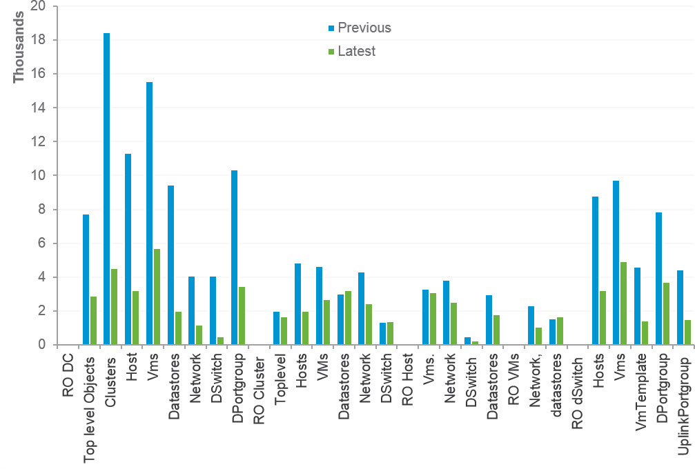
Performance Comparison
This graph is taken from VMare's website and it shows the performance improvements between the vSphere web Client 6.0 and its predecessors.
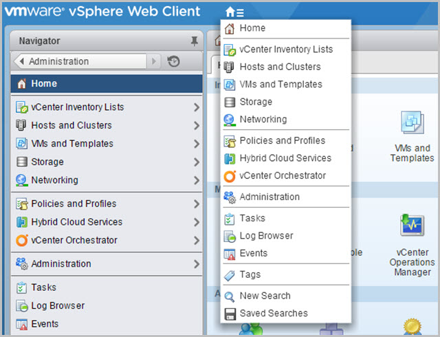
Better Navigation
One of the biggest problems with the Web Client has been the navigation. Navigating the inventory was such a pain the it was a turn off. VMWare has taken the feedback seriously and added a New Menu near the Home button which makes a lot of sense and you can find everything easily.
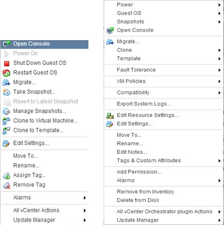
Redesigning of Context Menus
One of the main problems that Admins complained in the earlier versions of Web Client was that the context menus were different than what the Admins were used in the traditional Windows vSphere client. VMWare has improved that in the new version of the Web Client and it looks almost identical now.
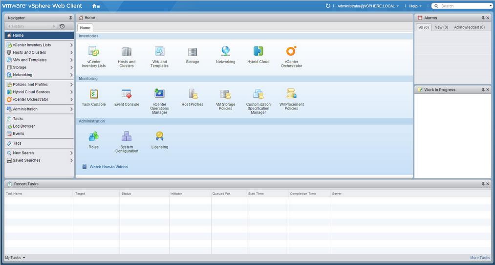
Recent Task tab moved Down
This is another example where Admins have been so used to the Windows vSphere client that even VMWare decided to change it the Web Client back to where it has always been.
In the previous version, it was above the Alarms section. Now the Alarms and Work in Progress can be pushed to the right and they pull out once you hover on them.
I hope this was informative and thank you for reading!


2 Comments
Thank you for writing.
Your welcome 🙂 I am glad you liked.